VDU and Pocket Pivots: “VooDoo” for your day trading
Jul 26, 2021
Written by: John McDowell
✓ Reviewed by Al Hill, Co-Founder of TradingSim · Updated Mar 31, 2026
Volume Dry Up (VDU) and Pocket Pivots are some of the most powerful precursors to big moves in the stock market when interpreted correctly. Often called VooDoo, for the acronym VDU, by discoverers Dr. Chris Kacher and Gil Morales, prior money managers for William J. O’Neil, despite how it sounds, this isn’t witchcraft we’re talking about. Though once you understand these concepts, you’ll certainly feel like you can divine the markets.
VDU and Pocket Pivots together are a form of volume and price analysis. It’s a lot like reading the tape. And when properly identified in a consolidation, these two chart patterns reveal the footprints of institutional buyers in the market.
As a quick primer for the advanced concepts below, check out this 4-minute video on how to find VDU and Pocket Pivot opportunities in TradingSim.
In this post, we’ll cover the ins and outs of the setup, how to spot it on a chart, and give a few examples of the explosive returns it can bring.
What is VDU?
VDU is simply short for Volume Dry Up. It occurs during a stock consolidation, typically at an area of decision.
Are we going down, or are we going up? That is the question being answered by these candles.
If the answer is “up,” then we typically see a healthy consolidation of higher lows, accompanied by lack of supply. For this reason, there are usually at least one or a few indecision candles associated with the VDU.
In addition, on a daily chart, the men who discovered this pattern set forth the rule that the VDU candle must be less than 50% of the average volume. In other words, very little selling pressure compared to prior candles.
The idea here is that in the absence of supply any prior selling pressure will eventually give up due to a lack of downside follow-through. This will add fuel to the fire as bulls begin licking their chops for higher prices. A signal, if you will, that demand is greater.
What is a Pocket Pivot?
If the VDU is the signal that supply is weak, then the Pocket Pivot is the confirmation that demand is present. And together the VDU and Pocket Pivot create an entry signal.
From the backtesting that Kacher and Morales performed, they found that as a stock moves sideways during consolidation it tends to increase in volume as it “restarts” its upward trajectory.
To that end, they discovered these “demand” candles that would move up through or away from the popular moving averages like the 10sma, or the 20ema, on a daily chart. Often this occurred after a VDU day. And in order for the Pocket Pivot to confirm, it needed to have a positive (green) closing price on volume that exceeded any prior negative (red) closing bar for at least 10 days.
This would indicate that the demand for higher prices was higher than any supply coming into the market.
How to Visualize VDU and Pocket Pivots
As with any charting exercise, it is always best to see real examples. So, let’s look at a few annotated charts to better understand this concept.
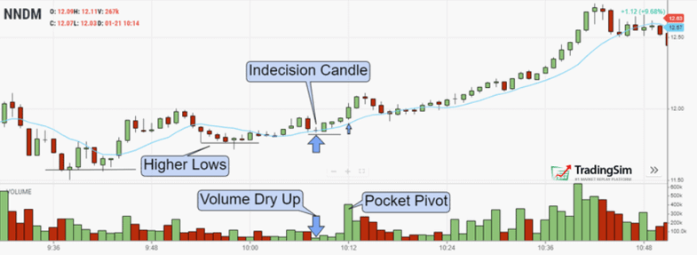
Just after 9:30am, the chart puts in a bottom. It then proceeds to consolidate into the VCP or pennant pattern. Sideways movement, if you will.
Then notice very closely that the annotations point out an indecision candle right on top of the 10sma. This candle is accompanied by extremely low volume. In fact, it is the lowest volume candle on the entire chart. This, friends, is “voodoo,” or Volume Dry Up, as it were.
You may be thinking, but what about all the other lower volume bars before that one. And that’s a good observation. But with any trade signal, we want the best confirmation as possible. The tighter the pattern/consolidation, the better. Notice how in the prior “waves” of the pattern that put in higher lows, volatility was still much higher.
We’ll discuss a few of these considerations more in-depth in a moment.
Where to Enter
Ideally, you want the pennant to coil tightly in this area of “final decision.” Here’s what we’re looking for in this setup:
After this constructive “lack of supply” bar or area, you want to see support come in. Think about the bears in this situation. They’re hoping the stock will follow through to the downside, but the “short” cavalry has left them all alone. When bulls sense this, the volume comes in — anticipating the break out.
This leads us to this “pocket pivot” bar on the chart above. Shorts begin covering, and early entry breakout buyers begin loading their positions. This is your earliest entry signal and offers you a better risk/reward than waiting for the breakout.
The result? As you can see from the chart, this leads NNDM from $12 to $12.70 in a very short amount of time.
The Pressure Context
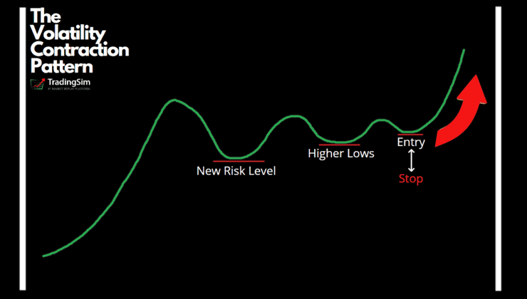
Before looking at the next example, we’d like to emphasize the importance of an impending breakout on a bigger picture time frame. Much like we discuss in our post on the Volatility Contraction Pattern (VCP), VDU and Pocket Pivots typically work best in tandem with overhead selling pressure. Hence, the impending breakout.
There are four main reasons for why this creates a pressure keg for a breakout:
Short-biased traders are often wont to catch a double top.
This area is often a profit target level for earlier dip buyers.
Bag holders who bought the first top are looking to sell and break even.
Breakout buyers are looking to squeeze shorts and go long.
The result? Tons of selling pressure meeting an underlying demand. Thus we see the battle play out into a pennant formation. The tighter it gets, the higher the likelihood of a violent move in either direction. The determining factor obviously being the stronger of the two forces.
Let’s see how this looks with a chart example.
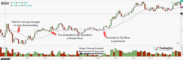
VDU and Pocket Pivot Example #1: WISH
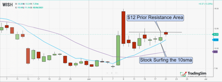
Let’s start with the higher time frame using a daily chart of WISH. Focus your attention on the annotations.
First you’ll see that WISH has a large red candle that sold off, plus an area of resistance denoted by the horizontal line at around $12. By 9:30am, WISH was knocking on $12’s door again after finding support along the 10 moving average.
WISH surfing the 10sma and hitting $12 resistance
With this context in mind, there are a couple of things that could happen:
WISH fails at this $12 resistance area again and potentially retreats to $11/$10
WISH breaks through and tries to retest the $14/$15 highs
In order to know whether we want to go long or short, we need see the intraday price action. Will it be bullish or bearish?
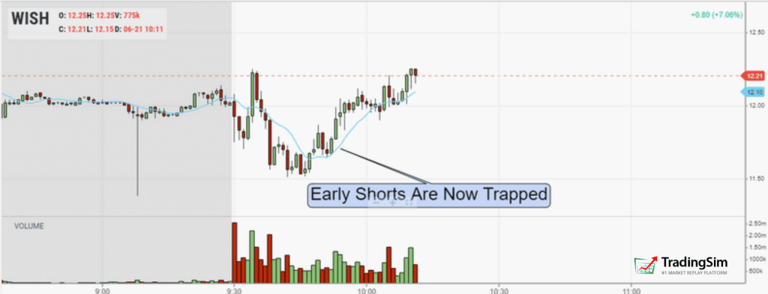
In this look of the first 45 minutes of trading, we see that shorts begin piling in around that $12 level. The first dip of the day looks scary. However, it doesn’t last long.
WISH trapping shorts
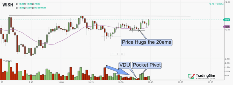
This sets the hook in the early part of the day. Now, we need to see some sort of constructive “basing” to occur. If we get a pullback and consolidation, ideally volatility will contract, which could set us up for a low-risk entry.
In the next image, we see that price did, indeed, begin to consolidate as more selling pressure from the $12 area is absorbed by buyers. Note the important 20ema providing support as VDU and Pocket Pivots begin to emerge within the pattern.
With entry taken on the close of the VDU candle and ensuing pocket pivots, all that’s left is to manage the trade.
Trade Management
For this type of setup, refer to the prior diagram for early entry on the pocket pivot.
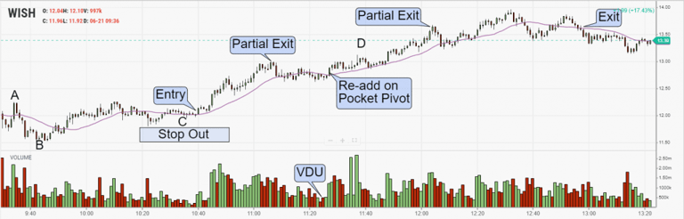
Professional Day Trader Nate Michaud calls this the “abcd pattern.” The first run is the A, the low is B, and the entry area becomes C. Profit is found in the D area after the pattern breaks out. Here is a great YouTube explanation on this from InvestorsUnderground.com
For our WISH trade we can see that we are taking the trade in the “C” area of this abcd/VCP pattern. To that end, we’ll set our stop below either the low of day, or the second higher low. This will depend upon your appetite for risk and position size.
WISH Trade Management
As the trade develops, we get a chance to sell into strength and re-add using our VDU and Pocket Pivot rules. Finally we exit the trade after a double top pattern for a gain of over $1.50 with a $12 entry. If risking to $11.50 on this trade, the r/r ends up as 1/3. Not bad!
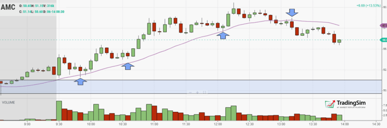
VDU and Pocket Pivot Example #2: AMC
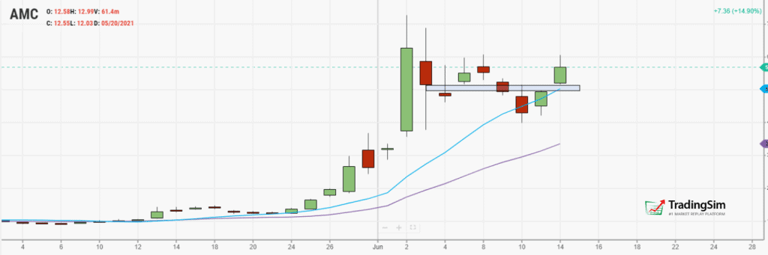
Similar to the WISH example above, we’ll start by analyzing the higher time frame daily chart. When we do, we see that AMC had found support along the 10sma, and was gapping up on the morning of the trade.
AMC gap on the daily chart
That morning gap held three times off the open, and provided the context for support needed for longs. In fact, it held well enough to trap any short-biased traders looking to fade the gap.
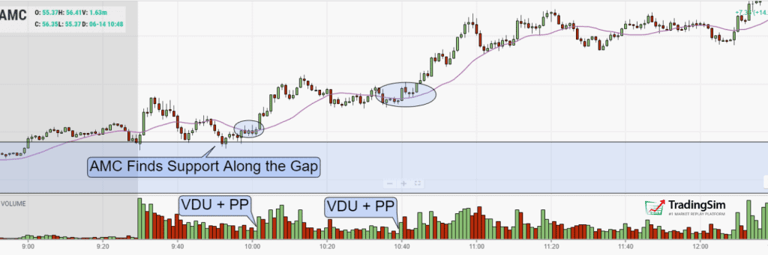
The result was a series of consolidations moving the stock higher and higher after a round of VDU and Pocket Pivots.
AMC VDU and Pocket Pivots
Note the shaded rectangle drawn from the daily chart and superimposed on this 1minute chart above. As that area supported, supply began to dry up, providing a nice Pocket Pivot long signal in the circled area.
However, if you missed the first entry, it set up a second time around 10:40am in the morning — a similar VDU and Pocket Pivot setup as the first. Notice a few things about these proper entry points:
The price action is finding support close to the 20ema
Quite a few inside bars or indecision candles
Higher lows
Volume gets lower and lower as the correction matures
Price explodes off the 20ema with big volume
Price expands as the breakout nears
Altogether, it is a recipe for disaster on the short side, but success for bulls.
Trade Management
Sometimes higher time frames can keep us in a stock longer. For that reason, it is always a good practice to at least consult multiple time frame charts. If we do that with AMC, we see that after our initial entries, the stock minds the 20ema on the 5 minute chart quite well. It also gives us a signal to exit.
AMC 5min chart trade management
Our initial stop loss could have been set in the blue zone around $50. With an $8 dollar profit, our r/r was 1/4. Again, not bad!
VPU and Pocket Pivot Considerations
When trading this setup, it is important to understand context. Let’s first reiterate the rules for a pocket pivot candle:
A positive (green) closing price on volume that exceeds any prior negative (red) closing bar for at least 10 bars.
But! This doesn’t mean anywhere on the chart. And the same goes for the VDU candles.
To that end, let’s bring the WISH chart back for closer examination. You want to make sure your criteria are being met.
Pocket Pivot Considerations
As you can see, you want the VCP pattern to mature. This isn’t to say you can’t take a shot at a VDU and Pocket Pivot combination while the stock is still volatile. However, the best setups arrive when volatility is low, the stock is trending sideways, and your entry can be made close to an important moving average.
The same goes for VDU. When looking at a chart, you might be able to find a candle with low volume just about anywhere. But context matters. We want to see this occur within a constructive base. If it happens a few times, even better. But eventually, we need the volume to return and give us the sign that buyers are still present.
Trading Ranges
It is also important to note that VDU and Pocket Pivots can occur within other basing structures besides Volatility Contraction Patterns. They can occur in sideways trading ranges, cup-with-handle patterns, and even in small pullbacks in an otherwise healthy uptrend.
Regardless, the concept and rules remain the same. Keep the entries as close to the 10 or 20 moving average of whatever time frame you’re trading off of.
How to Practice VDU and Pocket Pivots
By far, the best way to practice “training your chart-eye,” as Gil Morales puts it, is to flip through charts. In their book, In the Trading Cockpit with the O’neil Disciples, Gil and Chris offer many pages of chart examples to help build your spatial memory.
However, these are daily charts. If you want to practice this strategy for day trading, we recommend using a replay service like TradingSim.com. Start out with the following checklist:
Search for stocks with high premarket volume using the new scanner
Look for stocks making new 52-week highs
Fast-forward through a number of stocks that have high % gain on the day
Jot down notes on how the stock reacted to key levels on other time frames
Note the time of day for the breakout
Identify any other criteria that affected the pattern (float size, short interest, etc.)
You should find a plethora of examples to choose from each day. Once you have your criteria set. Begin replaying these setups and trading them with paper money in the sim.
This will give you the confidence to take real trades, and help you identify opportunities as they play out in real-time.
John McDowell is the Lead Content Strategist at TradingSim. His journey into day trading began in 2016 after conversations with a retired hedge fund manager. John is passionate about teaching and educating traders, curating content that helps others succeed in the stock market.
VCP Pattern: Volatility Contraction Trading Guide [Updated April 2026]
The Volatility Contraction Pattern, or VCP, as it has come to be known, has been popularized by Mark Minervini in his books Think and Trade Like a Champion and Trade Like a Stock Market Wizard....
How to Spot a Healthy Pullback Opportunity while Trading Stocks (Updated 2026)
[Updated May 2026 — refreshed for current market context and SEO best practices.] Pullback opportunities are great for adding to or initiating positions while trading. However, not all pullbacks are...
20 Moving Average Pullback Strategy: Rules & Practice [Updated April 2026]
The 20 moving average is an extremely popular indicator in the world of trading. It’s use is ubiquitous no matter the time frame or the type of stock, commodity, currency, or other issue being...


 Awesome Day Trading Strategies


