5 Key Differences between Logarithmic Scale and Linear Scale
Jul 10, 2018
Written by: Al Hill
✓ Reviewed by Kunal Vakil, Co-Founder of TradingSim · Updated Mar 31, 2026
Every stock chart contains two axes – x-axis to plot time and the y-axis to plot price.
There are basically two ways to plot price – linear and logarithmic.
While most traders are unaware of how the price scale is set, there are some key points every trader should consider when it comes to logarithmic scale vs linear scale.
In this article, we will discuss the five key differences between semi-log and linear scale on price charts.
Linear Scale
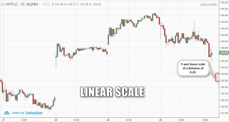
There are some traders who expect to see an equal distribution of price values on the y-axis – linear scale.
For example, a linear price chart could have an equal distance of 5 units on the y-axis (i.e. 0, 5, 10, 15).
The chart below shows an example of the linear scale chart for Apple (AAPL). You can see that the price chart has a y-axis with a .20 unit of measure.
Example of linear scale chart with distance of $0.20
Logarithmic Scale
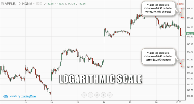
Conversely, the logarithmic chart displays the values using price scaling rather than a unique unit of measure.
With a logarithmic chart, the y-axis is structured such that the distances between the units represent a percentage change of the security. For example, this percentage difference can be 5%, 10% or 15%.
The next chart shows the same Apple stock chart but with logarithmic scale enabled.
Example of log scale chart with distance of 0.30% approximately
While prices look rather congested at the bottom, such as 140.40, 140.70 and so on, the distribution becomes spread out further apart as price values progresses.
This is because as the values increase in size, the preceding units of measure are smaller and thus visually look smaller on the chart.
Now imagine a stock that first traded at $50 dollars and over time trades north of $300 dollars (i.e. Netflix). The early years of trading at the lower price levels will look like rooftops when you are looking out of the window of an airplane before you land.
2. More Volatility = Logarithmic Scale
If a security has small price moves and choppy trading action, a linear chart would probably be the best method for charting the stock.
However, we know price movement for penny stocks and biotechs is anything but boring.
For these types of securities, the logarithmic price chart makes more sense as it can visually capture the significance of the larger price moves.
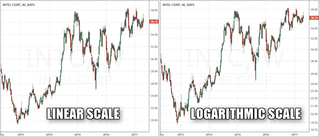
The next chart shows a comparison of a linear and logarithmic chart for Intel (INTC).
Comparison of the linear and logarithmic scales for INTC price chart
Although both the linear and the log-scale might look very similar, the differences stand out when you closely review the distribution of the price on the y-axis.
It is evident that the linear price chart shows a more curved line. You can also see the linear chart somewhat depicts the idea that price moved rather slowly in the initial periods before price started to move more rapidly in the latter parts.
This distortion occurs because the price is in absolute dollar terms. On the other hand, the logarithmic chart shows a steady 1% approximate percentage change in the values and shows a more uniform scale of price change over the period of time.
Therefore, a logarithmic chart is more suited in the above example as it depicts the growth of the stock price on a steady note with a fairly straight trajectory. When the pace of growth starts to change, the logarithmic chart also adjusts accordingly and depicts the change accordingly, which isn’t the case with a linear chart because the values remain the same, regardless of whether price moved just $0.50 or 5%.
3. Logarithmic Scales are Useful for Long-Term Perspective
To quickly recap, the price scale is equal with linear charts. This means that a move from $100 to $150, which represents a 40% move is the same as a move from $200 to $250.
You can see that the distribution here is $50 per unit, but in percentage terms, you have a 40% move initially (from $100 to $150) and a 22% approximate move from $200 to $250.
In such cases, large price movements are better with logarithmic charts which focus on the percentage of the move.
4. Linear Scale for Day Traders
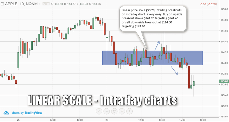
On the other hand, a linear price scale is more applicable to analyze a security that is moving in a tight range or within a short time frame such as intraday trading sessions.
Linear scale is ideal for intraday charts or short term charts
The above chart example shows a 10-minute price chart for AAPL using a linear price scale. Again, the units are an equal distance of $0.20 cents. You can also see an example of a simple breakout method relatively easy to spot and trade.
Because of the equal distribution in absolute dollar terms, the $0.20 price range that was established in the sideways market gives the upside and the downside target at a distance of $0.20 making it relatively easy to trade the short term price charts.
Even if you would use a logarithmic scale on the intraday charts, because the price movements are typically confined, you will get the same results as using the linear scale chart.
5. Which Price Scale to Use?
When it comes to analyzing stocks, the price of the security is usually analyzed in relative terms. Metrics such as price earnings ratio, price book values are popular financial ratios. Thus, when depicting the price of the security in question, it makes more sense to represent or analyze the security’s stock movement in percentage terms rather than in absolute values.
Therefore, chances are that traders are automatically shown the appropriate price scale without even knowing the difference between the two types of price scales.
At the end of the day, the security dictates whether you should choose a linear price scale or a semi-log chart or a logarithmic scale chart.
Even within stocks, not all securities behave similarly. While on one hand there are stocks that have explosive price movements, there are also stocks that are typically confined to a range over years.
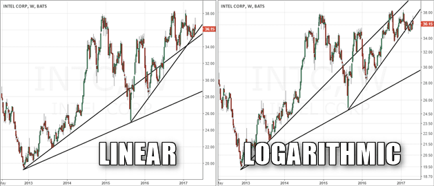
Bonus – 6. Trends are Better with a Log-scale Chart
I decided to update this article with a sixth section covering trend lines on two chart types.
Let’s start with a simple example of drawing trend lines for the same security and compare how the trend lines evolve between a linear and logarithmic chart.
Trend lines plotted on a linear and a logarithmic chart
The above chart shows Intel Corp (INTC). On the left we have a linear price chart and on the right is the logarithmic chart.
The trend lines plotted on both charts are exactly the same.
This brings us to the question of which of the two charts depicts the trend accurately? It is the logarithmic price scale chart on the right side which shows the trend lines much better as compared to the trend lines from the left.
The answer to this question I’m going to leave up to you.
In Summary – Logarithmic Scale vs Linear Scale: Which Scale is Better?
The answer to this question depends on a number of factors such as the security in question and how price behaves and of course the time frame as well. However, the log scale or the semi-logarithmic price scale is more popular than the linear scale.
Nearly all charting platforms default to the logarithmic scale as the units are equally spaced in percentage terms, making it easier to use the log scale as a base chart across any security that a trader wants to analyze.
As illustrated above in some of the examples, there are clearly certain scenarios where using one type of price scale is definitely better. At the end of the day the type of and its price behavior will determine the right price scale.
Alton Hill is the Co-Founder of TradingSim with over 18 years of trading experience. He completed the Design Thinking Bootcamp at Stanford’s D.School and brings expertise in Product Development to create the best trading simulation experience. His strategy focuses on trend-following systems, targeting high-volatility stocks with strong primary trends using the 15-minute chart.
How to Scale out of Winning E-Mini Positions Scaling in trading is a concept that is associated with adding to or subtracting from a trade. Scaling ensures that traders can effectively and wisely use...
Market Scanners – Tool for Identyfing Trading Opportunities
Market Scanner Definition A market scanner is a vital component to any day trading strategy. Successful day trading comes from trading the most volatile stocks in the market. Since day traders have...
Day trading requires you to have quite a bit of cash on hand for your trading activities. Margin aside, I have said you need 50 to 1 cash to monthly expenses ratio. There is a little bit of room here...