Kagi chart is a type of chart that is used to track the price movements of a security. Unlike traditional stock charts such as the line, bar (OHLC) or candlestick charts, the Kagi chart pattern is unique. While time and price are two variables that are plotted on traditional stock charts, with Kagi, only price is considered.
Therefore, a Kagi chart has only price, which is plotted on the y-axis and not time, which is plotted on the x-axis. By removing the element of time, a Kagi chart pattern gives a clearer picture of what price of a security is doing. It eliminates, what is referred to as “noise” in the market, which is common to the candlestick and bar chart.
A Kagi chart pattern is unique as it plots price like a “snake” and in a continuous form. When price is falling, the line is plotted in red color and when price is rising, the Kagi line is plotted in green color, when the previous highs and lows are breached.
Traders use the Kagi chart pattern due to the way it represents price, eliminates noise and shows clear trends. A Kagi chart is mostly used in technical analysis and among day traders.
The first chart below shows an example of a Kagi chart for the AAPL stock chart.
Example of a Kagi Chart
You can see how different the Kagi chart looks like compared to one of the more traditional forms of stock charting. Although on the Kagi chart, you can see time; this is redundant and irrelevant to the concept of this type of chart.
2 – History of the Kagi chart
It is said that the Kagi chart was originally developed in Japan, during the 1870’s. This was around the time when the stock markets were introduced in the region. Kagi charts were originally used in Japan to track the price of rice. Back in the day, Kagi chart helped traders to understand the supply and demand levels. (Candlestick charts were also designed initially by the rice traders in Japan).
The fact that Kagi charts are still used to this day, and are commonly found on most charting platforms is a testament to the effectiveness of this type of analysis.
Kagi charts, along with a number of other time-independent chart types such as Point and Figure and Renko charts were introduced to the western world by Steve Nison.
Nison spent a considerable amount of time in Japan, studying the various unique chart types. He also published numerous books on the various charting techniques that are used today.
3 – How are Kagi charts constructed?
A Kagi chart is created by a series of vertical lines which depict price movement. These vertical lines are connected by a horizontal line. In some charting platforms, a Kagi chart can also change the thickness of the line. This occurs when price reaches the high or the low of a previous level.
With a Kagi chart, a predetermined price is used. For example, if you selected a value of 5, that would represent a $5 move in the security. Or a value of 0.10 would mean a $0.10 move in the price of the security.
A Kagi chart can also be configured on a percentage basis. A 4% setting for a Kagi chart would mean that when price reaches 4% movement, it will change the direction accordingly.
When there is a reverse price movement, a horizontal line is plotted.
A Kagi chart can also be configured by using the average true range (ATR) value. In this case, the 14-period ATR value is used as the setting for the Kagi chart. Of course, the downside being that when the ATR value changes, the Kagi chart setting also changes.
In the next chart below, we have an example of a Kagi chart for the AAPL stock price. Here, we use a value of $1 or just 1.
Kagi Chart with $1 reversal price on a 5-minute chart
In the Kagi chart, the main factor is the setting itself, which shows the reversal. So, going back to the above example, when price closes below the previous low, a bearish Kagi is drawn (depicted in red line) or when price closes above the previous high, a bullish Kagi (depicted in green line) is drawn.
The base time frame is also important in the Kagi chart. For example, referring back to the “Kagi chart with $1 reversal price on a 5-minute chart,” the closing prices are taken from the 5-minute close.
Typically tick data is used, but considering that this is not always available on most charting platforms, the 5-minute or even 1-minute base time frame can be used.
To understand how Kagi charts plot price, take a look at the above chart, where we have three price levels plotted.
In the first instance, price closes at $155.78.
Then, price falls to $154.37, which is a difference of $1.41. Because this is greater than the setting of $1 reversal, we have the Kagi chart that plots lower.
It is still “green” or bullish because the previous low was not breached.
Then price rallies to $155.90 from the low of $154.37. This is a difference of $1.53. Therefore, we have a bullish Kagi chart plotted here.
Later on, we see price dropping to $148.76. This is a drop of $7.14. Here, we have a bearish Kagi because it broke past the most recent low of $154.37 and the decline to $148.76 was greater than the $1 reversal setting.
What we can observe from the above example is that trends are clearly depicted on the Kagi chart. Of course, to wait for this trend, day traders will have to wait for the Kagi chart to evolve. The decline from $155.90 to $148.76 would have occurred over a prolonged period of time.
4 – How to use the Kagi chart for trading?
Right off the bat, it is clear that technical analysis can be a great fit for the Kagi chart. Most importantly, support and resistance levels are clearly seen on the Kagi chart. You can also look at trend lines which can show when price is breaching the trend.
Referring to the next chart below, you can see some support and resistance levels and some trend lines that are plotted on the chart.
Analysis with Kagi chart
In the above example, after the trend line break, price fell sharply breaking past the previous low and thus turning bearish. This depicts that a bearish trend is in place. This is also validated by a rising trend line break and a rather flat top.
The support levels are nothing but the most recent and significant support levels on the price chart.
Following the break of the trend line, the Kagi chart declined to $149.92 and then continued lower.
Besides price action based methods, you can also use the Kagi chart to plot technical indicators as well. In the next chart below, we have a 10-period exponential moving average. The trends and the price interaction with the 10-period EMA are quite evident.
A bullish trend is clearly seen with the Kagi chart above the 10-period EMA, while a bearish trend is clear when you see the Kagi chart trading below the 10-period EMA.
Kagi chart with technical indicators
Therefore, with Kagi charts, traders can also make use of technical indicators such as moving averages, or even oscillators such as the Stochastics or the MACD. Day traders should ensure that only the indicators that are based on price can work well on a chart type such as the Kagi chart.
Trading breakouts, especially from support and resistance levels is also another way of using the Kagi chart correctly.
Trading breakouts with Kagi chart
In the next example above, you can see the support and resistance levels that are plotted. From the example, we can see that when price breaks past the previous high and the resistance level of $147.26, we can take a long position, targeting the resistance zone at $149.92 – $150.84.
A reversal near the resistance zone could also offer a good level to sell the decline.
Alternately, if the price of the security failed to break past the immediate resistance level of $147.26, then we could expect price to fall back lower, potentially towards the previously established support zone of $142.71 – $142.32 (In the above chart, we use a $0.50 reversal size).
5 – Key differences between the Kagi chart and the candlestick chart
There are many differences between the Kagi and the Candlestick chart. Some of the key differentiating factors are listed below.
A candlestick chart accounts for both time and price. Each candlestick represents one session. One session could be as low as 1-minute or even 1-week
A Kagi chart accounts only for price and does not consider time
There are no settings involved with a candlestick chart. But with a Kagi chart, the reversal price is an important setting to make
A Kagi chart shows only price movement, whereas a Candlestick chart shows how price moved within a particular session. A candlestick chart shows the high and low prices as well, which is missing with the Kagi chart. Only closing prices are shown on the Kagi chart
The Kagi chart plots the vertical lines connected by horizontal lines. When price breaks past a previous high, a bullish Kagi line is drawn, while a break down below a previous low results in a bearish Kagi line that is drawn
A Kagi chart can be applied to any market, similar to a candlestick chart
Both Kagi and Candlestick charts originated in Japan
The next image below shows a Kagi chart to the left and the Candlestick chart to the right. This comparison gives a better view of how different the Kagi and the Candlestick charts are and the way they behave.
Kagi Chart vs. Candlestick Chart
6 – What to watch for when using Kagi charts for technical analysis?
When using the Kagi chart for technical analysis, day traders should ensure that they are using the right reversal size. If this setting is too high, traders will remain on the sidelines and will have to wait for prolonged periods of time (weeks or even months) for price to depict a bearish or a bullish trend.
Using too small a size can result in a lot of whipsaws in the market (including spreads that needs to be considered).
One should also bear in mind that the reversal size will affect one’s trade management as well. There is obviously a big difference between using a $1 reversal box size or a $5 reversal box size.
The volatility of the security is another factor to consider. For some large cap stocks a $2 or a $3 price movement is not that difficult. While for some small cap stocks, a $1 move is the best that can be expected over a period of time.
Therefore, traders should not make the mistake of using a uniform Kagi setting for different securities.
7 – When should you use Kagi charts?
Using Kagi charts trading strategies requires a mix of both fundamentals and technical analysis. For one, time is not a factor.
Therefore, traders will need to pay close attention to how price is plotted on the Kagi chart. The base time frame also plays a key role. Obviously, a 5-minute chart shows the closing prices every 5-minutes, while a daily chart will show closing prices just once a day.
To be successful with Kagi charts trading strategies, it is important to understand how price action works.
Having a good trading strategy can be important for day traders. Price action based trading is also essential as you can clearly identify patterns such as double tops and bottoms, trend lines and horizontal support and resistance lines.
One should also know that volume is calculated differently if you must use it with a Kagi chart. The volume here is based on the entire volume that is made up of the price movement.
So typically, while you will see new volume bars plotted with new sessions, with a Kagi chart, you will see combined volume for a $1 reversal for example.
To conclude, the Kagi charts are very unique and requires a bit of understanding on how price works and how it is plotted on the Kagi charts. Traders will need to be very familiar with Kagi charts before they can expect any results from this form of analysis.
Do not make the mistake that Kagi charts will give you an edge in the markets. Price is price, regardless of whether you are analyzing the security using a Kagi chart or a candlestick chart. The main difference is that by eliminating noise, a Kagi chart can help traders to understand trends better.
How to Trade Diamond Chart Patterns – Winning Strategies
Diamond Chart Pattern Definition A diamond chart formation is a rare chart pattern that looks similar to a head and shoulders pattern with a V-shaped neckline. Diamond chart reversals rarely happen...
Overview As a day trader, a common question asked is should you trade daily charts? The root of the question comes down to the fact you are trading intraday, so why care about what’s happening on...
Overview of Swing Trading Swing trading is a form of active trading. The goal is to make a profit on a trade from a time span as short as a few days to a few months. You can place trades on both the...

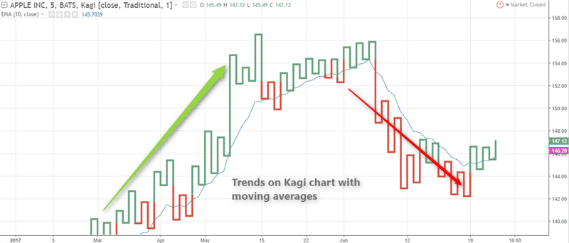

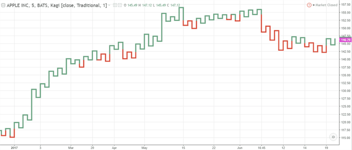
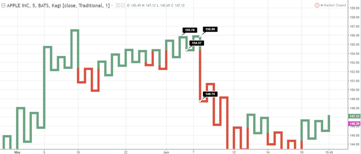
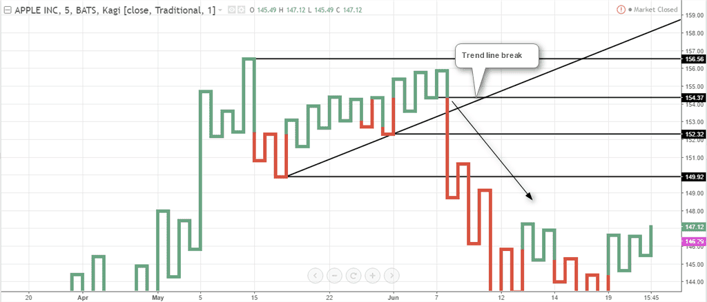
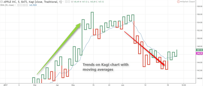
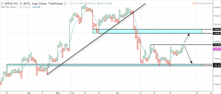
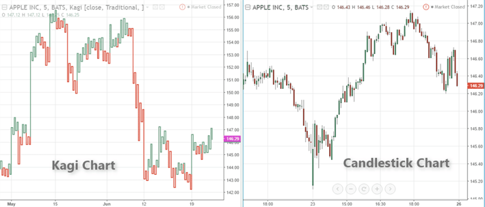


 Chart Patterns


