Candlestick charts are constructed using the same elements that the traditional bar charts use; however, traders using candlestick charting techniques are more interested in the sentiment indications that are derived from the different candlestick formations. In my experience, this provides a considerable edge over bar charts once you study the formations which I will discuss further in this series of articles.
Candlestick bar
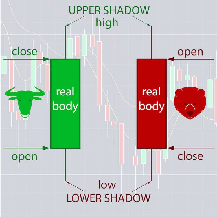
The bar is composed of the following components: high, low, open, and close. The rectangular portion of the bar is considered as the “real body”, this represents the range between the candle’s open and close. When the real body is black (or red in some stock charting applications), this indicates that the open is higher than the closing price of this period. Conversely, a white real body (or green in some applications) indicates a bullish tone with the close being higher than the open of that period. The “wicks”, or upper and lower shadows that you see on the bar represent the high and low of the period. You may already see visual benefits to the construction of the candlestick charts. Notice how it allows you to see whether the bulls or bears are in control immediately. Secondly, the size of the real body can tell you a lot about the conviction of the direction.
Basic Reversal Patterns
Let’s take a look at some of the common candlestick chart reversal patterns. Let’s get something straight here, these reversal patterns cannot be used as stand-alone indicators for trend reversal. You will lose money if you attempt to do this. We must analyze support and resistance, volume patterns, and other indicators in conjunction with these signals.
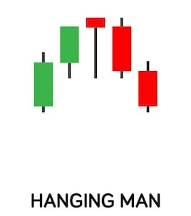
Hanging Man
Let’s start with the Hanging Man. This setup occurs after an extended rally and indicates that the trend is weakening and a possible reversal may be at hand. The ideal hanging man pattern consists of a short upper shadow, long lower shadow and small real body.
What does the candle tell us about the psychology of the traders in this stock? The long wick indicates that the sellers stepped in and dumped a considerable position into the market, most likely because they are taking profits off the table. As I said above though, the signals derived from candlestick charts cannot be used on their own; volume is also an important component of the analysis. For example, if you are day trading using 5 minute charts and the stock only trades 2000 shares per 5 minutes, this setup is most likely not the result of true selling but rather the result of a lack of liquidity. Illiquid stocks usually have large bid/ask spreads and this can cause violent swings in the price. I pay close attention to the time and sales window, otherwise known as the “tape”, to help me understand the nature of the buy and sell orders coming through.
As tops take some time to form, you need to wait for confirmation before you heed the signal of the hanging man. At least, wait for a close below the low of the hanging man before going short or selling your long position. This way, you confirm that all those traders that got long on that sharp bounce from the hanging man pattern are all now in a losing position. This will add to the probability that they will need to sell out of their long positions.
Hammer
The hammer is basically identical to the hanging man in formation, however, it occurs after a strong move to the downside rather than a move to the upside like the hanging man. The real body of the hammer can be black or white. Reason being, the formation indicates that there was panic selling in the stock. Ideally, we would have a white real body, but a black body is okay as they both indicate a strong move off the lows of the candle. The lower shadow should ideally be at least twice the height as the real body and there should be a very small upper shadow.
As with the hanging man, volume is very important in the hammer. High volume gives you further confirmation that a bottom may have been put in on this candle. In my experience, there is a 50/50 chance of a hammer being retested before the stock or market goes higher. Look for large volume on the hammer candle and if there is a retest look for dramatically lighter volume selling this down to support. A close below the hammers’ low would negate this pattern.
Now, there is a key difference in the two candlestick charting setups; market bottoms are made on fear while market tops are made with greed. Fear is much easier to gauge than greed and therefore, tops take much longer to form than bottoms. You will notice many times that once you see a hanging man come into the market, it will be retested a couple times as the big boys unload their shares to the greedy public. Conversely, fear creates a mob mentality which has everyone selling out at the same time. This type of trading washes out the weak hands and allows the big boys to eat all of those shares up. It is for this reason that bottoms create strong rallies in a very quick fashion.
Below is a classic example of a hammer formation using candlestick charts. I will use the Dow Jones Industrial Average (DJIA) to show you a clear example of how this works. Just recently, during the credit crisis that hit the stock markets, the Dow Jones printed a massive hammer at the lows of that sharp sell off from 14000. Notice the enormous volume and huge price reversal that occurred on this day. This was a panic bottom and this market rallied over 10% without a retest of those lows. You may not always get a absolute price retest; however, the market will provide a retracement that will give you an opportunity to size up a buy point.
DOW Hammer
We will cover the theories of price and volume in future articles; however, lets discuss some basic principles using the DJIA. After a spike bottom is made, there will be a automatic rally off of the lows. The high created from this rally will serve as resistance in the future. In this case, the automatic rally went to 13400, as marked by the yellow line. The reaction off of that high is called the “secondary test”. This level will serve as support and in essence we have our boundaries of a short term trading range. That range is now 13000 to 13400. We now look for clues to get long and that came in the form of a “spring” off the bottom of the range. A spring is simply a test of a prior low where that low has been penetrated intra-period; however, not closed below. That is exactly what we saw and this was a low risk buy entry on the close of that candle.
Engulfing Pattern
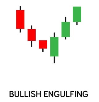
So far, we have covered two individual candlestick formations; I am now going to move focus to a few multi-candle reversal patterns. The first one, the engulfing pattern is a major reversal sign that is composed of two opposite color real bodies. The basis of this pattern is that the current bars’ real body engulfs the prior bars real body, not necessarily the shadows. The bullish engulfing occurs after a sharp move down while the bearish engulfing occurs after a sharp move higher.
Bullish engulfing formations are most powerful when they are combined with previous support levels. These patterns by themselves will make you lose more than not. Additionally, when scanning to find these setups, I find that the larger the candles, the more reliable the signal is. It is relatively simple to define your risk parameters when entering a trade based on this setup. Basically, a rule of thumb is that you can set your stop loss below the lowest low of the two candles involved; a move below this level would negate this pattern. Going forward, the lows that were set out of this pattern should provide strong support on any potential re-tests.
The bearish engulfing is same formation as the bullish engulfing but it is in the opposite direction. We are looking for the same sort of criteria. There are a couple of small tweaks that will make both of these patterns more reliable when you use them. Look for a small real body in the first candle of these formations followed up by a long real body on the second candle. This indicates that there is some force behind the move. Secondly, notice the speed in which the rally or decline takes place preceding the pattern. An engulfing pattern in this case can indicate profit taking. Finally, as I have been mentioning; volume has a large influence to whether or not this pattern will work. You want to see heavy volume in the second candle.
Wrap up:
We have gone over a few simple, yet powerful, reversal patterns using candlestick charts. Use these tools to supplement your analysis, not as your only form of analysis. As we discussed above, take a look at support and resistance levels which add to the validity of the formations as does volume analysis. In the following articles regarding candlestick charts, I will cover more formations such as: stars, doji’s, and three black crows.
Stars, Dojis, and Abandoned Babies — Powerful Reversal Strategies
Candlestick patterns can have some crazy names sometimes. Stars, dojis, and abandoned babies? The Japanese were fond of naming candlestick patterns after real-life visual representations. Shooting...
The Stick Sandwich Candlestick Pattern + Chart Examples
Candlestick patterns have been around for centuries. They are very useful in finding reversals and continuation patterns on charts. While we discuss them in detail in other posts, in this post we...
The Harami candlestick pattern is usually considered more of a secondary candlestick pattern. These are not as powerful as the formations we went over in our Candlestick Patterns Explained article;...


 Let’s start with the Hanging Man. This setup occurs after an extended rally and indicates that th
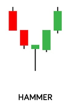 The hammer is basically identical to the hanging man in formation, however, it occurs after a strong move to the downside rather than a move to the upside like the hanging man. The real body of the hammer can be black or white. Reason being, the formation indicates that there was panic selling in the stock. Ideally, we would have a white real body, but a black body is okay as they both indicate a strong move off the lows of the candle. The lower shadow should ideally be at least twice the height as the real body and there should be a very small upper shadow.
 Bullish engulfing formations are most powerful when they are combined with previous support levels. These patterns by themselves will make you lose more than not. Additionally, when scanning to find these setups, I find that the larger the candles, the more reliable the signal is. It is relatively simple to define your risk parameters when entering a trade based on this setup. Basically, a rule of thumb is that you can set your stop loss below the lowest low of the two candles involved; a move below this level would negate this pattern. Going forward, the lows that were set out of this pattern should provide strong support on any potential re-tests.
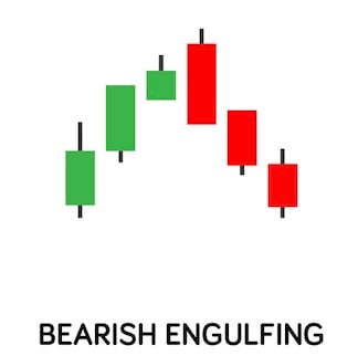 The bearish engulfing is same formation as the bullish engulfing but it is in the opposite direction. We are looking for the same sort of criteria. There are a couple of small tweaks that will make both of these patterns more reliable when you use them. Look for a small real body in the first candle of these formations followed up by a long real body on the second candle. This indicates that there is some force behind the move. Secondly, notice the speed in which the rally or decline takes place preceding the pattern. An engulfing pattern in this case can indicate profit taking. Finally, as I have been mentioning; volume has a large influence to whether or not this pattern will work. You want to see heavy volume in the second candle.


 Candlesticks


