Have you ever felt the devastating market force of a bear trap? The all but certain bullish trend stops abruptly and a trend reversal begins. Then you say, “Hey, let’s catch that drop!” and you short-sell the equity. Suddenly, the price does a rapid jump contrary to your trade! What a shame! Have you ever felt that? I bet you have. This is what traders call “The Bear Trap”. In this article, we will cover the inner workings of a bear trap and how to avoid falling into one.
A bear trap occurs when shorts take on a position when a stock is breaking down, only to have the stock reverse and shoot higher. This counter move produces a trap and often leads to sharp rallies.
Bear Trap Setup
The bear trap chart pattern is a very basic setup. You will want a recent range to be broken to the downside with preferably high volume. The stock will need to get back above support within 5 candlestick bars, then explode out of the top of the range. The last component of the setup is that the stock should have a decent price range. A wide price range is critical, as it increases the odds that the stock will have room to trend in order to book quick profits.
Why do Bear Traps produce sharp rallies?
The first wave of buying will occur when the most recent swing high is exceeded, due to the number of shorter term traders who have their stops slightly above the most recent swing high. The second wave of buying comes into play once the strong shorts realize that this is not just a dead cat bounce, but that the move has legs. This will produce the second bounce, which will often precede the short-term top in the counter move.
Bear Trap Chart Example
Below is an example of a bear trap on 7/6 for the stock Agrium, Inc. (AGU). You will notice that the stock broke to fresh two-day lows, before having a sharp counter move higher.

Bear Trap
How to Avoid Bear Traps
You will encounter many bear traps during your trading career. As we stated earlier, the key is not to fall into one. As you probably guess, it is impossible to avoid every bear trap; telltale signs you can lookout for in order to avoid these losing trades.
Volume Indicator
Market volume is one of the most important components for identifying bear traps. When a stock is starting to reverse, approaching new highs or new lows, you will notice volume beginning to accelerate.
However, what if the market changes direction and the volume is low? Watch out! This could be a bear trap!
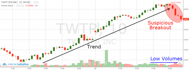
Bear Traps and Volume
This is the 10-minute chart of Twitter from Aug 26 – 27, 2015. The long black arrow defines the bullish trend. Suddenly, the trend line is broken and the price begins to decrease sharply, which is highlighted in the red circle. At the same time, volume is relatively low, which is a sign that the reversal is suspect at best.
So, is this a true reversal, or a bear trap?
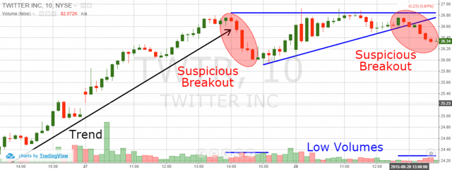
Bear Traps and Volume 2
After the break in trend, Twitter forms a base and then rallies back up to the recent peak.
Later, Twitter breaks the lower level of the blue triangle, thus giving the impression that the resistance area is too strong to be broken. However, the break through the triangle happens during low volumes like the previous break of the uptrend line. We have a second suspicious bearish breakout. Now what?
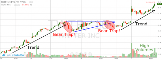
Bear Traps and Volume 3
If you had shorted after the trend break or the triangle breakdown, you would have gotten yourself into a bear trap! Notice that the real stock moves occur during high volumes. These high volumes were absent during the two breakdowns, hence a bear trap developed.
Fibonacci Levels
Fibonacci ratios are crucial for identifying trend reversals. If the price doesn’t break key Fibonacci levels, you should assume the price reversal is in question. These sort of minor breaks should be perceived as trend corrections, but not true breakdowns.
Let’s now see how Fibonacci fits within the bearish trap scenario with Twitter.
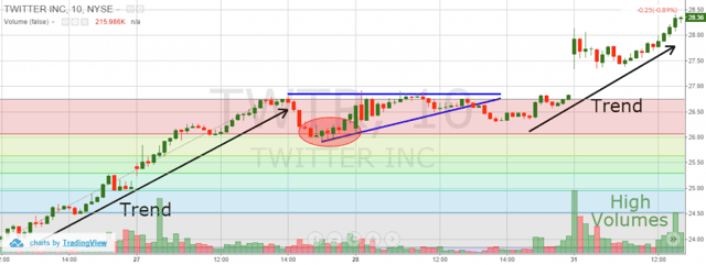
Bear Traps and Fibonacci Levels
Notice that after the trend interruption, Twitter finds strong support at the 23.6% Fibonacci Level. The next bottoms are not even close to this level. In our case, the price just bounces in the blue resistance. Then, the new rally appears.
Just as a rule of thumb, if a stock is unable to retrace 38.2% of the move, the primary trend is strong.
Divergence
If you trade with indicators, which give you divergence signals, then you can easily spot bear traps. If the price breaks downwards, but the indicators account for a bullish undertone, then we should suspect the bearish move is likely a trap. It is not that important which indicator you use. It is important that this indicator provides divergence signals. In the image below, I will show you how to spot bear traps with the relative strength index and MACD.
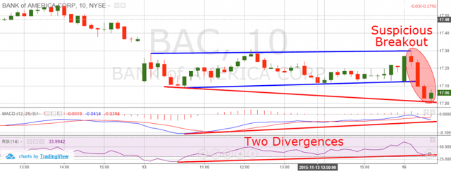
Bear Traps and Divergences
This is the 10-minute chart of Bank of America from Nov 12 – 16, 2015. The blue lines indicate a trading range, which BAC was stuck in for the majority of the day. The red circle shows the breakdown in the blue channel. The blue lines indicate the divergence between the price and the two oscillators. The red line on the chart shows that the price is making lower lows, while at the same time the MACD and RSI are clearly moving upwards. This creates two bullish divergences between the price and the two indicators, despite the bearish breakout. This is a sign that a short position would not be a good move in this case. Let’s now see how the trade actually developed.
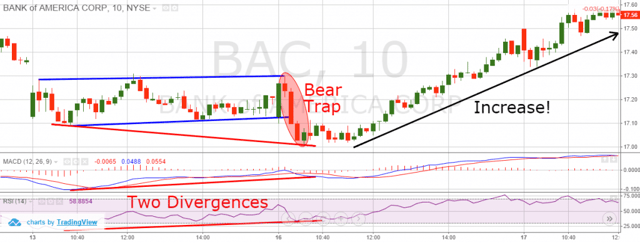
Bear Traps and Two Divergences
After the bearish breakout, the price starts a steady increase. This means that our breakout was indeed a bear trap. Fortunately, we managed to avoid the bear trap by spotting two divergences between price, RSI and the MACD.
Price Action
Here we are again discussing the most important stock trading component = the price action!
If the price action were screaming a bearish trend is coming to an end, would you go short? Not me!
Have a look at the example below:
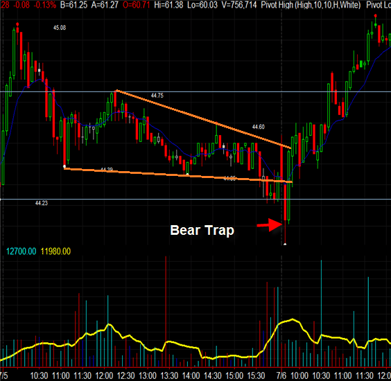
Bear Trap and Falling Wedges
If your first thought was that you have seen this chart before, then you are right. This is the same Agrium Inc. chart we discussed at the beginning of the article. The new thing is the orange lines, which create a clear falling wedge formation. As you probably know, falling wedges after bearish trends lead to trend reversals. Thus, we expect the price to break through the upper level of the formation.
In our case, though, the price breaks through the lower level of the falling wedge figure we stay out of the market avoiding the bear trap.
When the price gets back to normal and breaks the upper level of the wedge, there is even a long position opportunity.
Let’s now go through another bear trap example, which we can avoid with simple price action knowledge:
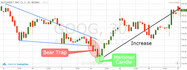
Bear Trap and Price Action Trading
This is the 30-minute chart of Google for the period Dec 9 – 17, 2015. This is another example of a bear trap stock chart, which could be easily recognized with simple price action techniques.
First, we have a falling wedge figure, which is outlined with the blue lines on the picture. We expect the price to break the falling wedge upwards, switching to bullish direction. Yet, Google breaks the falling wedge in a bearish direction, against the simple price action logic.
Even if we are lured into a short position here, we have a second chance to act wisely and to close the trade on time, when a hammer shows up four candles later. This is a famous reversal candle pattern, which signals an upcoming price increase. If we close our short position after this bullish signal, we will not only avoid big losses, we would also have generated a profit equal to $2.50 per share!
Note that this is not a good practice at all. Do not attempt to trade a reverse bear trap on purpose. If you get yourself into a bad trade, try to play your odds as best as possible in order to get out of the market unscathed.
How to Protest Yourself Against Bear Traps
The answer to this question is ridiculously simple and you can find it in every bear trap book – use stop loss orders!
If you enter a bear trap and you have an active stop loss order, what does this mean? This means that worst-case scenario you will lose no more than what you have planned to lose. Thus, your bear trap trade will not bankrupt you.
Conclusion
- It is called a bear trap, because this chart pattern often lures traders into short positions only to quickly reverse to the upside.
- Bear traps could sometimes be identified and avoided.
- Some of the tools, which help us against bear traps are:
- Volume Indicator – low volumes represent move uncertainty.
- Fibonacci Levels – price tends to bounce from crucial Fibonacci levels.
- Divergence Tools (like Oscillators) – Bullish divergences imply upward price move.
- Price Action – patterns could often contradict to bearish breakouts.
- If you find some of these four signs during bearish breakouts, this could be a bear trap.
- Spotting bear traps help us avoid them.
- Bear traps could easily be hedged simply by putting stop loss orders on your trades.
- The opposite equivalent of bear traps are the bull traps.
- Bull traps act the same way as bear traps but in the opposite direction.


 Day Trading Indicators


